Shared Waters Conservancy
Problem
The International Joint Commission offers fantastic Public and Indigenous Engagements, press collaborations, and more. However, its current non-engaging brand hinders public engagement.
Solution
The target audience for this rebrand of the IJC is professionals outside the environmental industries. This innovative rebrand aims to encourage engagement from industry outsiders, helping the organization achieve its public engagement objectives. To transform the International Joint Commission into the “Shared Waters Conservancy,” the strategic objective was emphasizing innovation and a “human touch” in the refreshed identity.
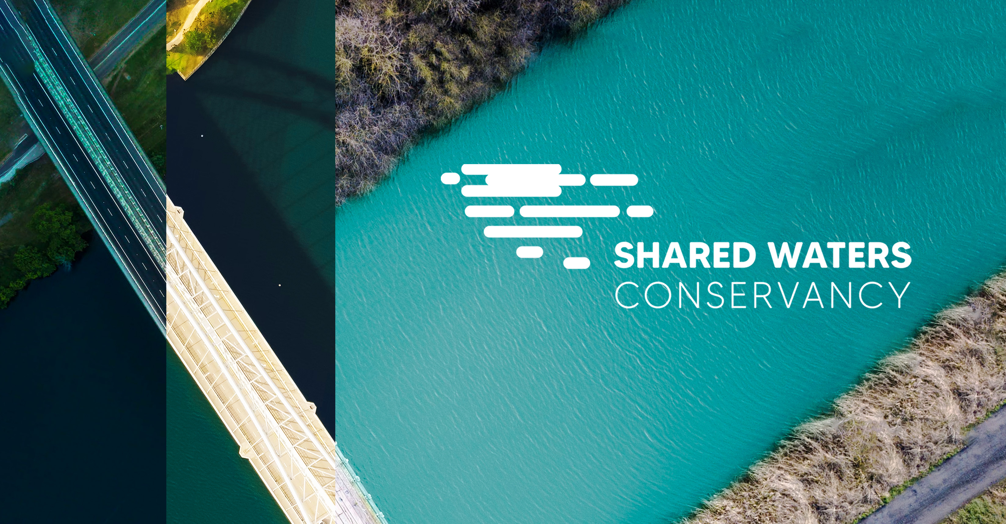
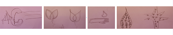
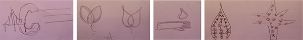
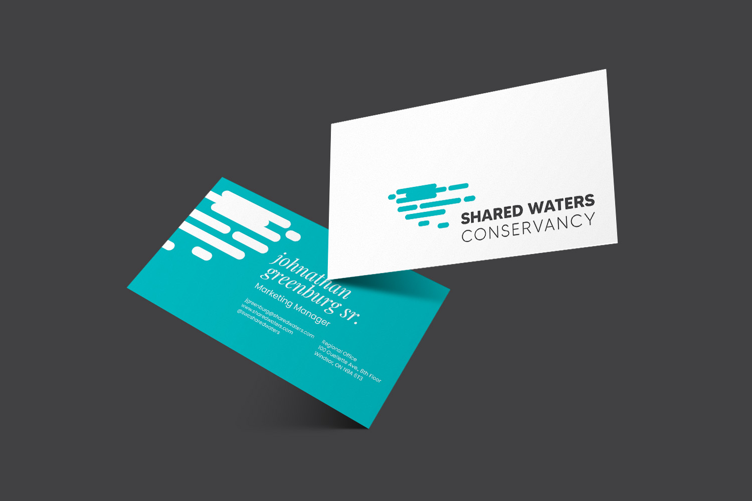
The Logo Redesign
Their previous logo was overwhelming and created a disconnect between those who looked at it and the organization itself. It felt uninviting and there was so much going on within that circle. I aimed to reduce as much as possible to create the opposite effect: something interesting, abstract, and friendly. The typeface for the logo is a soft-edged sans-serif font, helping the logo feel current, since the purpose of this rebrand is to help the organization appear more human and approachable.
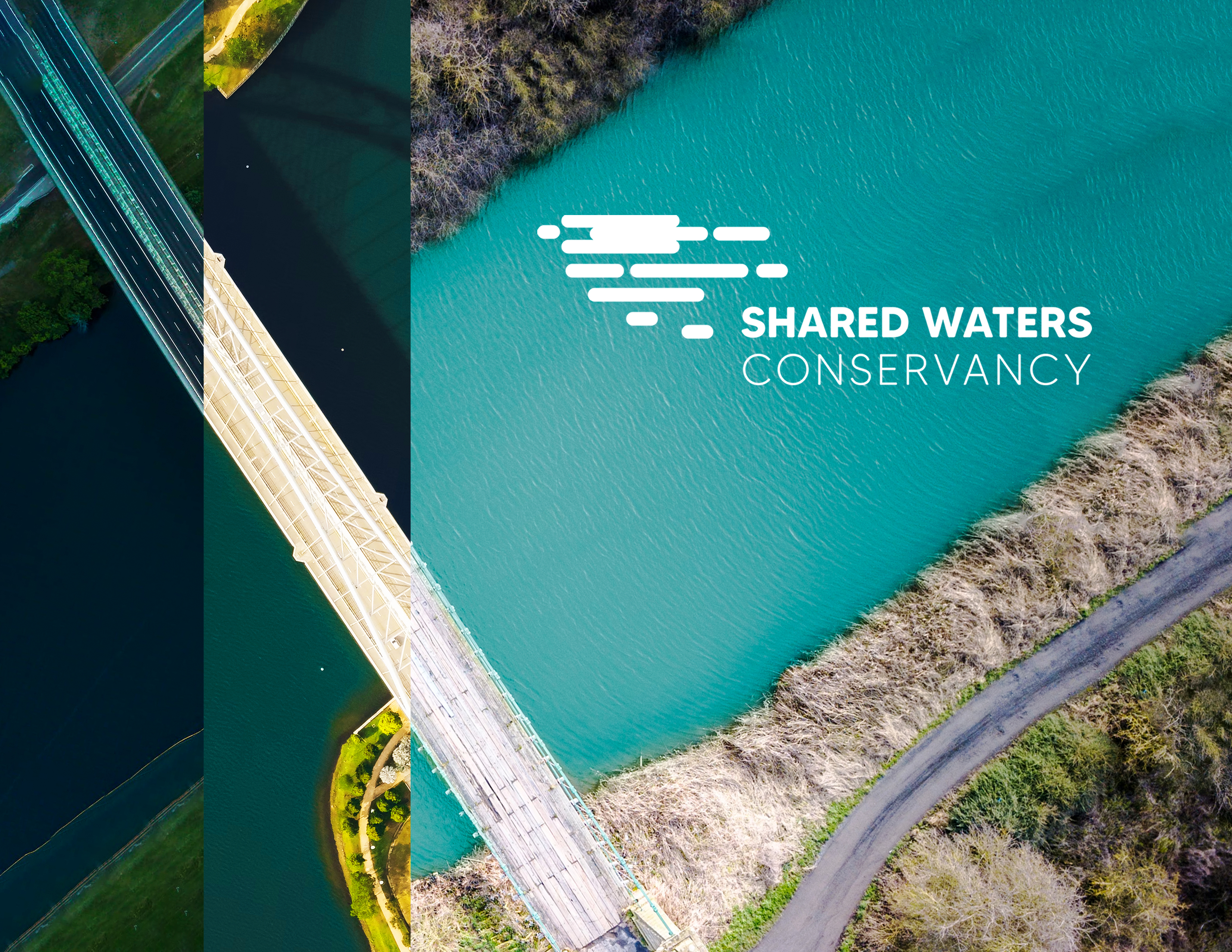
The Photography
The International Joint Commission has three offices: one in Windsor, one in Ottawa, and one in Washington, D.C. This graphic with three different roads, bridges, and types of infrastructure symbolizes the three remote offices cross-collaborating and working as one to solve issues regarding the bodies of water across Canada and the United States.
Infographic Design
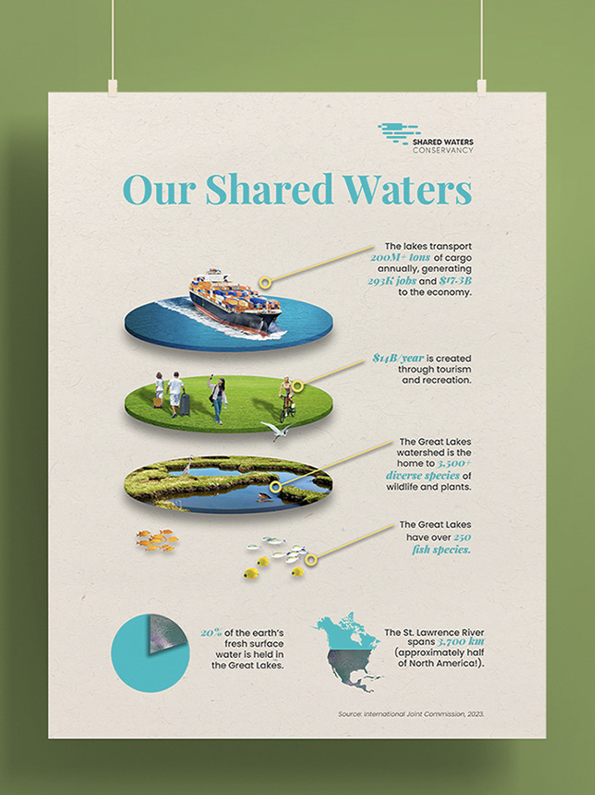
This infographic's 3D layered style draws inspiration from exploded diagrams, which are popular in city planning—a key influence in the SWC rebrand—and industrial design. Elements are stacked in real-world order, from sea life below the surface to cargo ships above. The photorealistic style reflects the IJC's new forward-thinking, revitalized tone.
Reflections
This rebrand simulated a potential real-world scenario where design may be brought in to address the needs of a business or organization in some way. In reality, design is never for the sake of just good looks; it always serves a broader business purpose. Getting crystal clear on what the objective at the beginning of the project was guided everything visually and set a North Star to always refer back to. Had that been half-baked, the final deliverables would not have been great. It was really fun weaving in a strategic direction into the project, and it sparked an interest in blending strategy with design and visuals.