Cleo: Beauty of Old Civilization
Cleo targets budget-conscious and socially-conscious 18-24-year-old women seeking a luxury skincare experience at mid-level prices
The Market Comparison
Cleo's brand needed to take inspiration and motifs from three domains: popular North American, mid-range skincare brands, luxurious and high-end cosmetics brands, and Egyptian-origin labels.
Mid-Range Skincare for Teens and Twenties
Feels clean and minimal but also repetitive and forgettable. Often relies on type and colour. Each package blends in; no package stands out without word-of-mouth or celebrity endorsement.
Luxury International Skincare
Minimal, but elevated with glass or metallic packaging. Unique personalities in each brand. But some of these print finishes are too expensive for Cleo’s mid-level budget.
Egyptian-Origin Competitors
Gold accents, minimal illustration, variety of approaches. Proves decorative touches are possible at mid-range pricing. But some feel too “handi-craft” for Cleo’s audience.
Telling Cleopatra's Real Story


The Design Solution
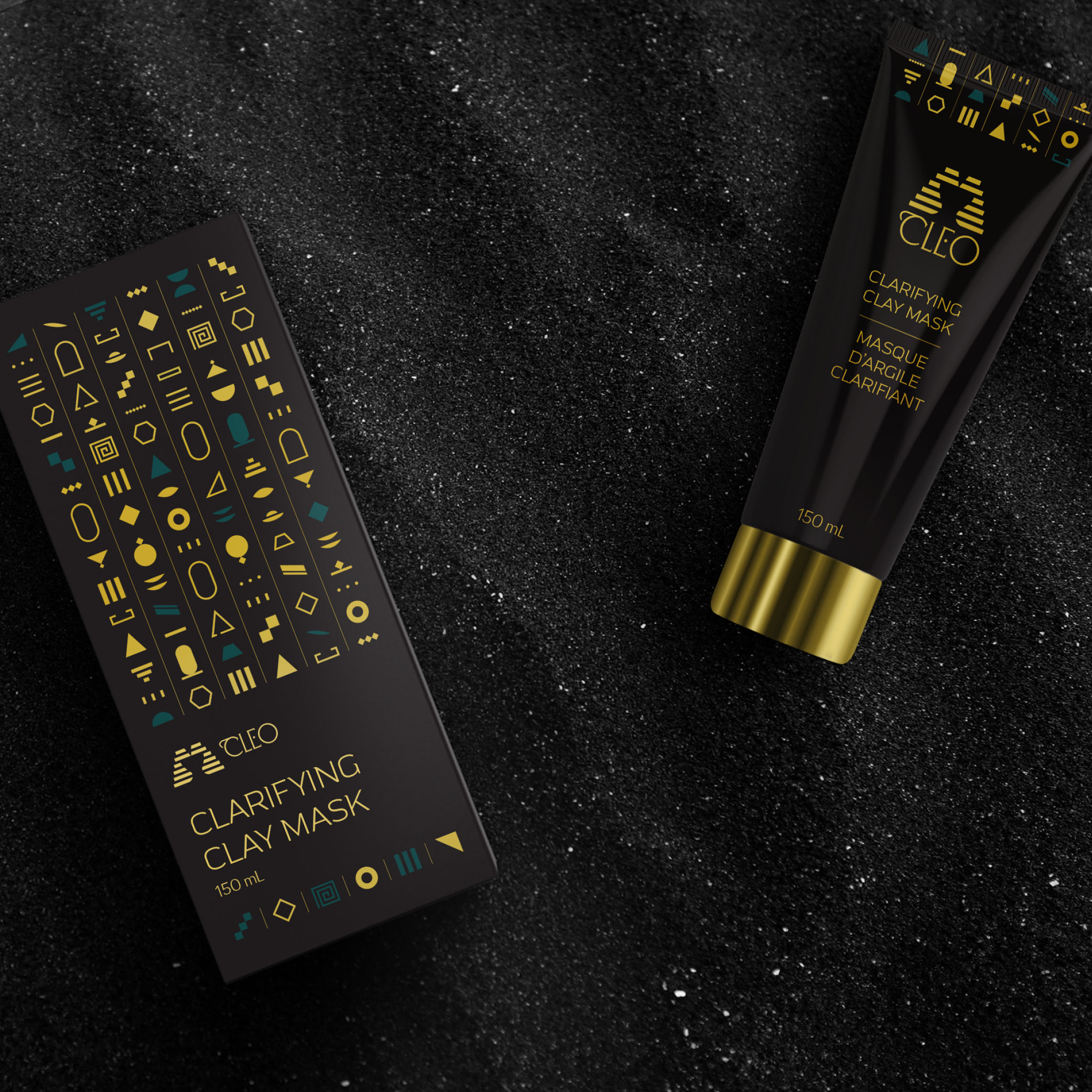
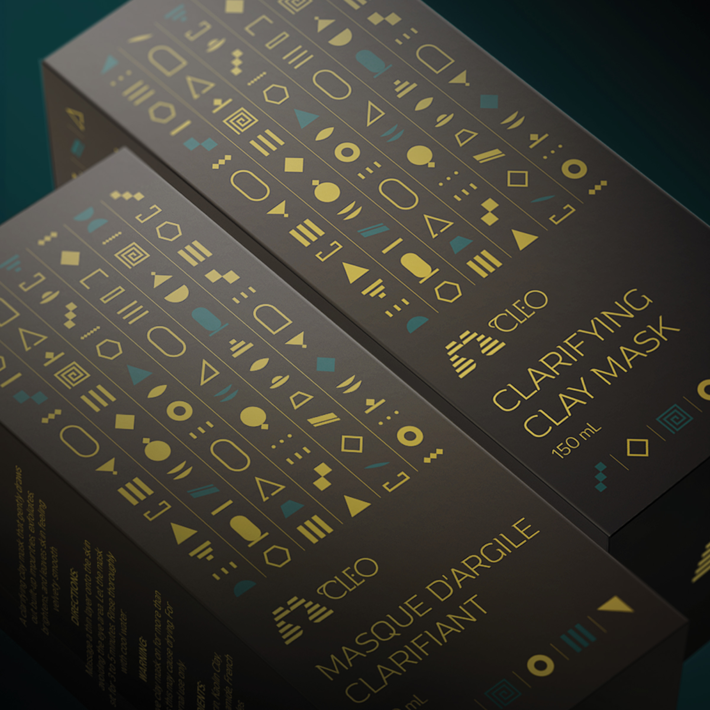
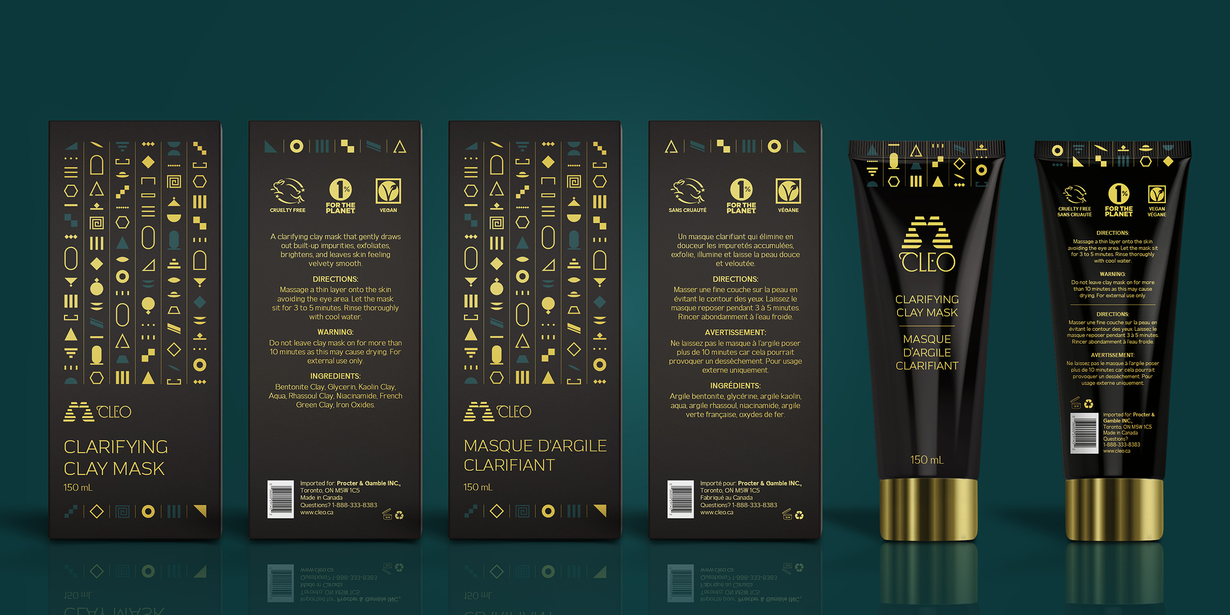
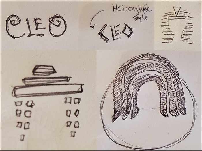
Cleo's brand identity invites consumers to feel beautiful, elegant, and empowered, just like Cleopatra herself did. Market research revealed a preference for geometric illustrations among our audience over detailed ones influenced the simplified representations of hieroglyphics on the packaging.
The Importance of Colour
Cleo's brand identity places significance on black, which represents Cleopatra's mysterious traits, gold (which represents luxury), and blue, which echoes back to the hues used in ancient Egyptian art centuries ago.
Honouring God Geb
To maintain affordability and honour the Egyptian God of the Earth, Geb, Cleo opts for eco-friendly boxes and tubes over costly glass, metal, or printing finishes seen in higher-end products. The cost of those finishes actually drives the price of the product up, not the formulation itself.